I know half my ad dollars are wasted; I just don’t know which half…

Though it’s just a humdrum car commercial during SNL, it’s interesting that Toyota starts its Prius commercial with “unless you walk, bike, or fly everywhere … ” (you care about gas mileage). Great — unless you live in most of New York City. In fact, we do walk, bike, or fly* everywhere, if you include the train in flying.

It’s certainly reasonable to advertise the Prius in the NY Metro DMA, given the large population in outlying areas that is car-dependent. However, it might be reasonable to consider opening line ad copy that doesn’t instantly reinforce the fact that the product on offer is of little or no consequence to a significant segment of the viewership.

What do other NYC residents think?

Posted in qualitative marketing analysis | Tagged , | Leave a comment

Statistically, Santorum is the anti-Paul

An interesting way to look at the results of the Iowa Caucuses is to view each county as an individual data point. This gives us a convenient set of 99 data points and yields some insight into the Iowa voter, if you believe that there is a correlation between a voter’s physical location and his or her political propensities.

Cluster Analysis of 2012 Iowa GOP Primary Results

Each dot represents one county in Iowa.

k-means Cluster Analysis was used (in R) to group each county into one of three clusters. For you non-quants out there, this simply means that we asked the computer to group each Iowa county into one of three groups — based on how similar that county’s voting percentage results (for all 6 top candidates) were to other counties.

The green cluster appears to be counties of strength for Ron Paul. The red cluster appears to be counties of strength for Rick Santorum, and while Mitt Romney did well in the black cluster — it’s not quite as distinct of a set as the green (Paul) and red (Santorum) clusters.

The middle row, rightmost column’s chart clearly shows the interplay between Paul and Santorum. In counties where Santorum did well (towards the top of the chart), Paul typically fared poorly. In counties where Paul did well (towards the right of the chart), Santorum typically fared poorly. Such results lend evidence to the hypothesis that supporters of Paul are not likely to be supporters of Santorum, and vice-versa.

Mitt Romney’s results present an interesting case. On the one hand, Romney (like Paul) does worse-than-average in the red (Santorum) cluster. However, Romney performs reasonably well in the black and green clusters. Such a distribution could speak to the theory that the Romney areas and the Paul areas have more in common, or that Romney has a broader appeal than either Paul or Santorum. Another theory holds that Romney is a “default” candidate for those who lack the enthusiasm about Santorum or Paul. Either way, all of the top three candidates will soon have a test in New Hampshire that will help shed more light on their long-term prognosis. Plus, we have the wildcards of a potentially re-energized Gingrich, Bachmann’s graceful exit, and the perhaps under-rated Jon Huntsman.

Global Decision will leave it to the various SuperPACs to sling the mud.

Posted in analytical methods, campaign analytics, politics | Tagged , , , , , , , , | Leave a comment

Irvine Housing Blog becomes OC Housing News

From time to time, GlobalDecision provides in-depth analysis of the Irvine-area housing market as a contributor to the housing information and analysis blog run by Larry Roberts, known as IrvineRenter. Larry has expanded the scope of his blog to include all of Orange County, and has correspondingly migrated to a new website called the “OC Housing News” at OCHousingNews.com.

We’ve posted a number of pieces of analysis of the Irvine market on the Irvine Housing Blog, and we look forward to continue doing so on the OCHousingNews.com website. Because the new site deals with a broader geographical area than just Irvine, we have an opportunity to create city-to-city comparative analyses using advanced analytics. We look forward to further understanding the substitution effect and other trade-offs that affect consumer behavior when buying real estate.

Posted in real estate analytics | 1 Comment

Los Angeles Orange County (LAOC) Case-Shiller Nov 2011 Update

From the above chart, we can see the long term trend of home values in the Los Angeles / Orange County region. While prices have declined considerably from peak bubble pricing, prices are still elevated over pre-bubble (year 2000) levels. As data from the second half of 2011 works its way into the Case-Shiller index values, we expect to see a continued slow decline for home values.

The second chart drills in on the mid-term: Jan 2008 to Nov 2011. In this second chart, we can see why there is still some debate in the real estate world about whether pricing has “double dipped”. Case-Shiller index values hit cyclical lows in the beginning of 2009, before homebuyer tax credits temporarily boosted demand and prices. Once the tax credits ended, in mid 2010, prices moved towards a new less-distored (but certainly still heavily policy-influenced) equilibruim. Naturally, this new equilibrium price was lower than the price when housing was subsidized by $8,000/buyer. The tax credit was ultimately a “suckers” deal, where 2010 buyers got bilked into overpaying for housing (and property taxes). In fact, most 2010 FHA 3.5%-down buyers in Los Angeles and Orange County are now underwater homeowners.

The Case-Shiller Condo index for Los Angeles Orange County shows a different result. While the index value did bottom in early 2009, its rise was more modest thereafter. That index then hit a new cyclical low in Nov 2010 and continued lower from there. Condo values are now 6% below the early 2009 temporary bottom and should continue lower in the coming months.

Posted in case-shiller, los angeles, orange county, real estate analytics | Tagged , , , , , , , , , | Leave a comment

New lower conforming loan limit impact on Irvine, CA

Impact of lower conforming loan limits in Irvine, CA

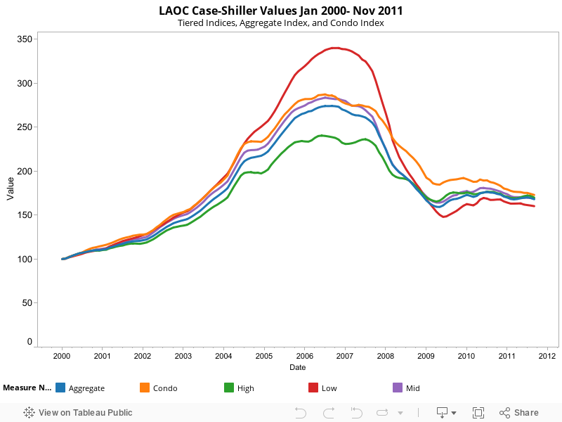
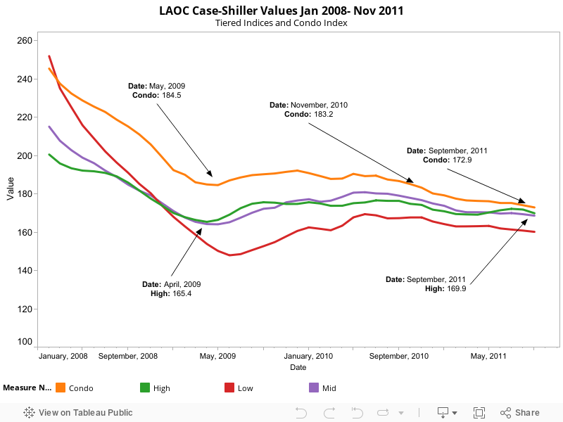
The above chart shows the distribution of home prices for all sales under $2M in Irvine, CA from 1/1/2010 through 7/31/2011. Irvine, CA is an expensive sub-market of an expensive region (Southern California). As a result, it is likely to feel any impact from lower conforming home limits more than most other places.

With that in mind, we’ve identified two potential price ranges that could be most impacted by the new limits. The green band represents homes that have selling prices where a 3.5% down payment represents a loan between the old limit ($729,000) and the new limit ($625,000). These properties represent 13.0% of all home sales in Irvine, CA. For the taxpayer’s sake, let’s hope that not many of the buyers in this price range are using only a 3.5% down payment. Those buyers are likely to be underwater soon as we predict continued downward drift in higher end home values in Southern California. These buyers represent one end of the spectrum.

On another point (but not the end, which would be “all cash” buyers) of the spectrum, we have buyers who put down 20%. At current Irvine, CA valuations, this is a substantial down-payment of around $170,000. For this level of royalty, we’ve used a purple band in the chart above. Using a 20% downpayment, 8.4% of sales in Irvine, CA would be impacted by the gap between the old and new conforming loan limits.

These are estimates — buyers in the green and purple bands have a few options. In order of long-term common sense for the buyer they are:

1. Pay less. Leverage seller fear that the loan limits really will reduce demand and correspondingly demand a lower price.
2. (tie) Put more down. Buy down the loan amount so that it becomes conforming.
2. (tie) Delay the purchase. The price-lowering impact from this change will be slight, but will occur over time. With an ongoing slow economy and prices above rental parity, there are no upward drivers for Irvine, CA home values.
3. Use “creative” financing. Pay the asking price but increase your monthly carrying cost for the term of the debt obligation.

Even though the higher limits don’t go into full effect until 1 Oct 2011, the delays involved in funding a loan will require that banks and brokers use the new limits as soon as possible.

Mitigating factor: long-term rates, paradoxically, plunged after the US downgrade. One can argue that it makes little sense that a downgraded asset class would be seen as safer after the downgrade, but that’s what Mr Market has said. Because rates are so low, investors will likely be interested in more non-comforming loans as the government makes its slow but necessary disengagement from being the mortgage underwriter of last resort.

Posted in real estate analytics | Tagged , , , , , | 1 Comment